Introduction
In the following tutorial, we are going to create for lack of a better word a hipster looking poster. Im calling it hipster since in my opinion this style has been rather overused recently. Never the less, its quite suitable in order to cover few procedures regarding how to achieve a vintage looking effect on photos, and play with adjustment layers.
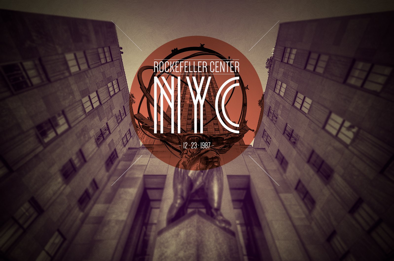
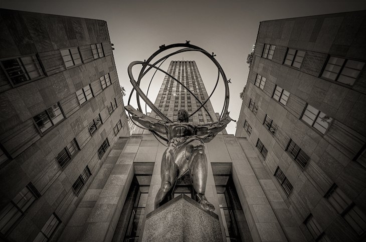
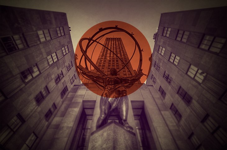
Preview
Download Assets
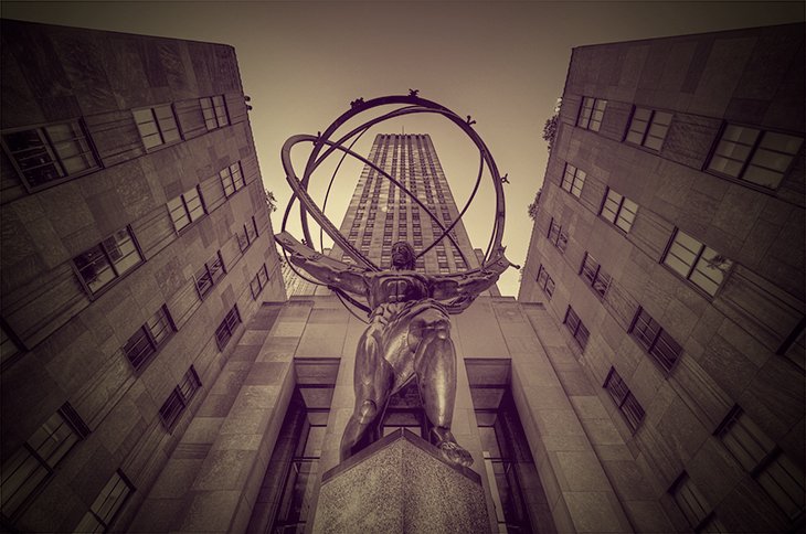
1. Black & White
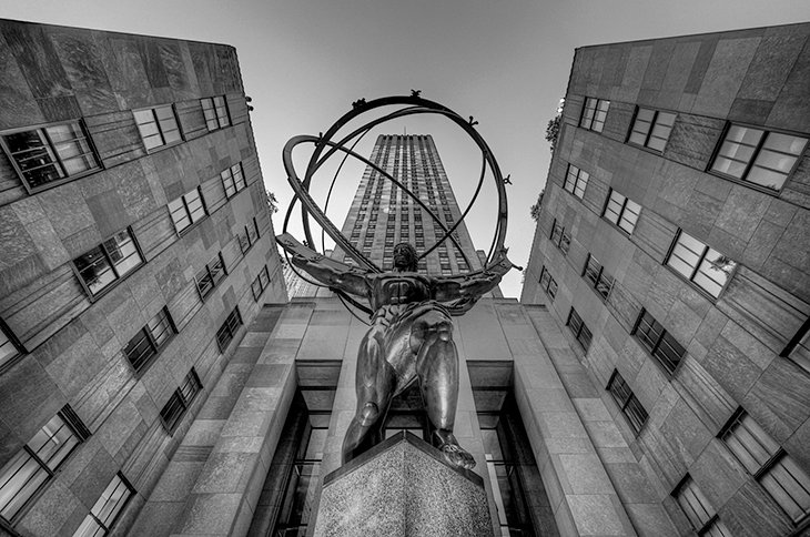
Open the Atlas photo in Adobe Photoshop, or any similar stock photo of your choice. Unfortunately I don’t know who the author of the photo I am using is, since its been laying on my hard drive for quite some time.
First thing you want to do is, convert the photo in to black and white. You can do that by going to Image / Adjustments / Black & White. The default settings work rather well for this photo, so just click ok and it should turn to black and white.
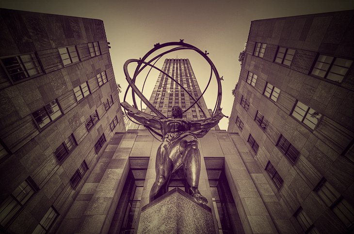
2. Gradient Map
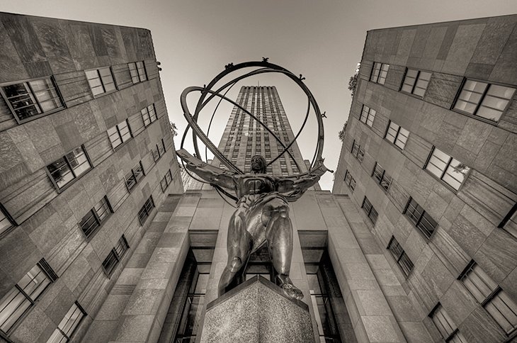
Now we want to apply a sepia like tone on our photo, and we are going to do that with a Gradient Map Adjustment Layer. Go to Layer / New Adjustment Layer / Gradient Map, and name the adjustment layer Sepia.
Just above the layers palette, you should find the Gradient Map Properties, first click on the Gradient Picker (The Green Shading On The Image Below) then click on the Settings Icon (The Yellow Shading On The Image Below).
From the settings menu chose Text Only, this will convert all the preset gradients in text format so they are more easily identifiable. Then open the settings again and chose Photographic Toning, Photoshop will ask you if you want to replace the current gradients, on which you should reply with ok.
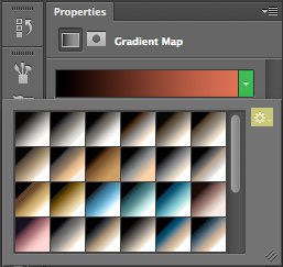
Open the Gradient Picker once again, and from the list of available gradient presets chose Sepia 4, and finally change the opacity of the gradient map layer to 40%.
In future use, you can just crank the opacity to 100% and get an almost genuine vintage effect on photos.
3. Vignette
Create a new layer, name it Inner Shadow, and position it above the Gradient map. Finally fill this layer completely with black color. Now with a rather large Eraser Tool of about 1500 px and hardness at 0%, click twice right at the middle of the photo. In the end change the blending mode of the layer to Multiply with opacity of 80%.
4. Adjustment Layer
Now we are going to add another Adjustment Layer, and once again it will be a Gradient Map. The only difference this time is, we are going to chose the colors of the gradient map ourselves. First create a new gradient map, and on the layers palette position it above the Sepia map but below the Inner Shadow layer. Now from the gradient map properties click on the gradient, and chose the following colors for our new map: #640270 and #dcb201.
5. Brightness & Contrast
Now we need to make slight adjustments to the brightness and contrast of our photo, and once again we are going to use adjustment layer. This time from Layer / New Adjustment Layer chose Brightness / Contrast and from the properties of the adjustment layer chose 15 for Brightness, and 55 for Contrast. On the layers palette, this layer should be positioned just above our photo, and below every other adjustment layer.
6. Sharpen
In order to make the finer details stand out a bit more, you will need to increase the sharpens of the photo. First selecting the photo from the layers palette, and then go to Filter / Sharpen.
7. Create Pattern
Now we are going to create a pattern of the subtle white feather image, but we need the darker shades of the pattern standing out a bit more.
First open the Subtle Feather Pattern (Subtle_white_feathers.png) in a new document, then change the brightness and contrast of the image by going to Image / Adjustment / Brightness Contrast, to -55 for brightness, and 30 for contrast.
In the end go to Edit / Define Pattern, name the pattern for future use and click ok. Feel free to close this document now, since we are not going to use it any more.
8. Pattern Overlay
Back to our main document, first we will need to unlock our background layer, in order to do that, just double click on the lock of the layer.
Now open the Blending Options of the background layer and add a Pattern Overlay. For pattern chose the one we just created, with blend mode of multiply and opacity at 100% for the layer style.
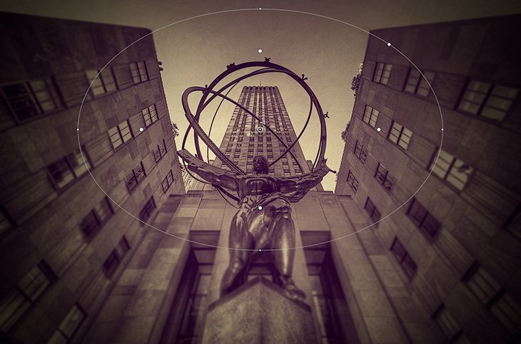
9. Iris Blur
In order to make the central theme of the poster which is Atlas, stand out even more, we are going to add an Iris Blur, which will create sort of a fake focus on the image.
Select the layer of the photo and go to Filter / Blur / Iris Blur, change the value of the blur to 15 px, and position the iris just like in the image below.
10. Red Ellipse
Now we are going to add the red overlay in the middle of the photo, and in order to do that we are going to use the shape tools. First create a new layer and chose the Ellipse Tool with a fill color of #d05942, then draw a circle like in the image below, and don’t forget to hold shift while you draw the circle.
Finally position the layer above all the adjustment layers, and change the blending mode to multiply.
11. Image Section
We want the image inside the red circle to be a little less saturated, or better yet without all the adjustment layers interfering.
Simply hold ctrl and click on the shape layer from the layers palette, this will create a selection of the shape. Select the photo layer from the layers palette and hit ctrl+c. Now paste the selection by hitting ctrl v, in turn this will automatically create a new layer with the selection we copied earlier.
In the end position the new layer above all the adjustment layers but below the red circle shape.
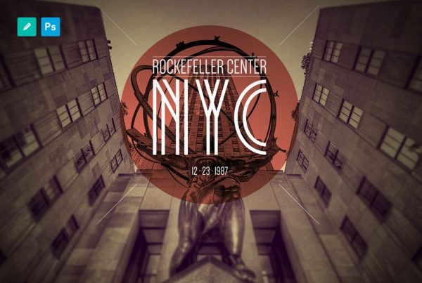
13. Add Text
All we are left to do is add the text, and I don’t think you need me holding your hand for this step. All you need to know is, for the NYC text I used the Metropolis font with size 287.85 pt, and for the Rockefeller Center I used the Dense font with size of 63.88 pt, while for the year its once again Dense but with size of 36 pt.
12. Add Lines
Once again create a new layer, and from the shape tools chose the Line Tool with a white fill color, and draw one line at an angle of 45 degrees. Just like with the circle, hold shift while drawing the line, so you can more easily draw it at a perfect 45 degrees.
Now simply duplicate this layer, flip the duplicate horizontally, and position it accordingly. Then once again duplicate both layers, flip them vertically, and position them accordingly.
Final Product
Conclusion
I hope you had fun doing this poster, and learned a thing or two about adjustment layers. Even though this type of design might be overused, the main idea behind this tutorial was to get you comfortable with adjustment layer.
In the future you can use the same process up to step 3, but with a higher opacity in order to convert regular photos into vintage ones. You could further enhance the vintage look, by adding a texture on top with scratch marks.
Don’t be afraid to experiment, you can even make your own personal Instagram effects with slight modifications to the adjustment layers we used. Also try the same effects on a color photo, instead of a black and white, the results you will get will be completely different, have fun experimenting!
Download PSDSimilar Posts

I was looking for this… it’s good @psdchat.. lovely
A very nice job, helful! Thank you